CSS Loading Strategies: Am I doing it right? (part 2 of 2)
In part 1 of this series, we introduced common CSS loading strategies and techniques and our methodology of testing different combinations to find the best setup for your website. In today’s article, we’ll dive into the specifics and outcomes of each test setup.
To compare our test cases and determine the best solution, we first need to automate the process of executing and gathering data from each test case execution. We employed the SpeedCurve tool, which enabled us to define as many test scenarios as needed and automatically run multiple times a day on different devices. The UI of SpeedCurve included other graphs and visualizations that allowed us to review and compare the results quickly.
There are dozens of metrics to define web performance, and it can be hard to decide which ones to pay attention to. These are a few that are widely considered to be industry standard, and the ones we chose to focus on:
- LCP - Largest Contentful Paint (seconds): Elapsed time since page load until the most significant element inside the viewport is rendered. Lower values are better.
- Visually Complete (seconds): Elapsed time since page load until all the content inside the viewport has finished rendering. Lower values are better.
- Speed Index: Unitless metric measuring how fast the viewport content approaches its final render status over time. (Typically, the result is translated into seconds for simplicity, though it’s not a time-based metric; detailed information on the formula can be found here.) Lower values are better.
- CLS - Cumulative Layout Shift: Unitless metric that reflects how much the position of the viewport content drifts during page load. Lower values are better.
- TBT - Total Blocking Time: Sum of the time the main thread was busy with any task whose execution time exceeds 50ms. Only excess time apart from 50ms will be taken into account (75ms task => 25ms TBT). Lower values are better.
In addition to these industry-standard metrics, we chose the following metrics to understand each test scenario better. (As some are not readily available in the SpeedCurve interface, we used custom scripts and manual data gathering to measure them)
- Start Render (seconds): Elapsed time since page load until the first non-white content is painted to the screen. Lower values are better.
- Fully Loaded (seconds): Elapsed time since page load until there is at least a gap of 2 seconds without any network request, including those triggered from JS. At this point, the page is considered to be loaded, and the test execution is finished. Lower values are better.
- Render Main Thread Work (seconds): Sum of the main thread spent on rendering-related tasks (Layout + Painting). Lower values are better.
- Render Main Thread Work (%): Percentage of the page load time that the main thread spent on rendering-related tasks (Layout + Painting + Loading). Lower values are better.
- Frames Under 60FPS (%): Percentage of the frames displayed until the DOM load event performed under the 60FPS target (1/60 seconds). Lower values are better.
Determining the best CSS loading solution
It’s important to understand that there is no one-size-fits-all approach to CSS loading strategy. The perfect implementation depends on many factors, such as the page structure, the number of different components placed within the page, and the CSS architecture itself. In our case, the page was CMS-based, and most of the content as defined by the authoring process, so blocks added into the first viewport could easily change. This meant we were striving for a balance between performance optimization and flexibility.
What did the results show us?
Based on our tests, we had a precise winning combination.
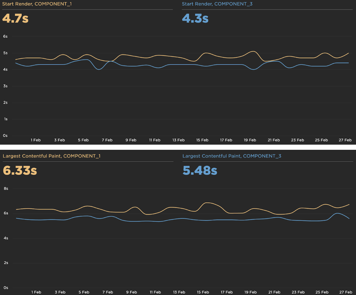
1. Regular Loading (COMPONENT_1) vs. Lazy + Async Loading (COMPONENT_3)
The combination of Async/Lazy Loading achieved great improvements in Start Render and Largest Contentful Paint metrics:
2. No Inline CSS (COMPONENT_3) vs Inline Critical CSS (COMPONENT_5)
Using Inline CSS implementation helped to reduce the rendering times even more. It’s worth noting that not all above-the-fold content was included in the file in our specific scenario – we only had the primary and shared CSS, plus the first Hero component. We were also missing styles from other candidates like the Main Navigation component. With a better tailored Critical CSS setup, we would expect to see these numbers improve even more.

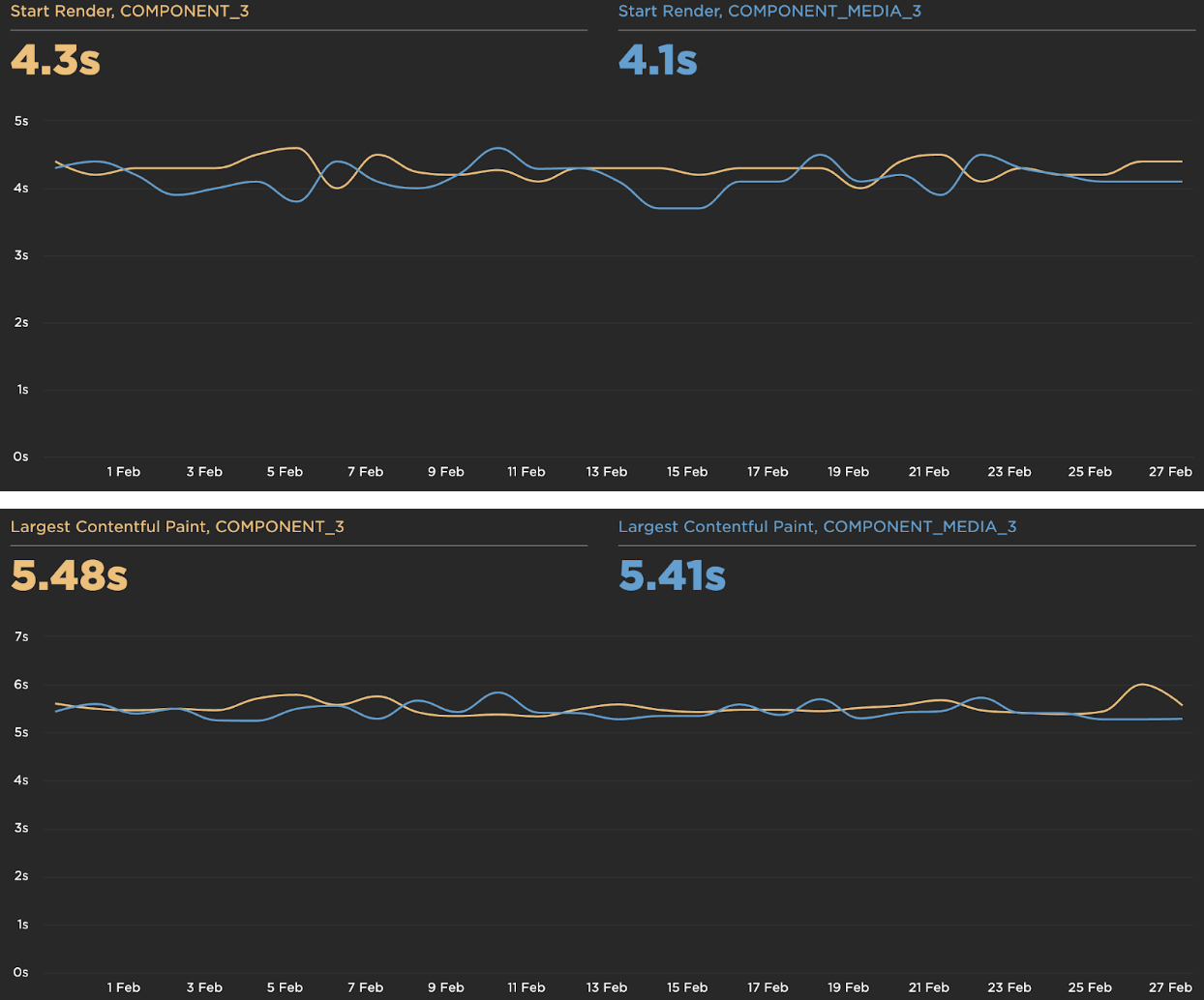
3. Splitting by component (COMPONENT_3) vs. Splitting by component + Media query (COMPONENT_MEDIA_3)
****Going one step further, we went beyond splitting files and split by components and media queries. This meant taking each component’s CSS and creating a separate file for each viewport size. This led to some improvement in the Start Render Times and a marginal improvement in the Largest Contentful Paint.
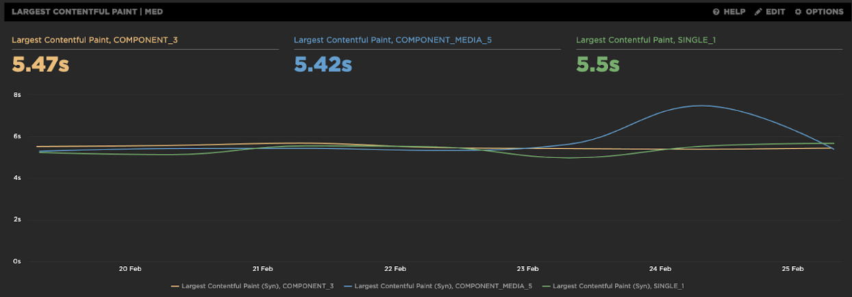
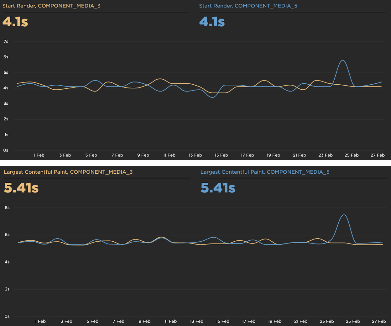
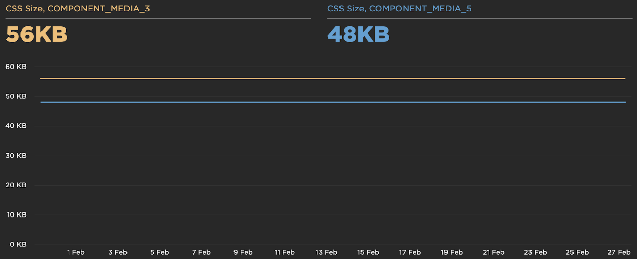
4. All Media Queries loaded (COMPONENT_MEDIA_3) vs. only used Media Queries loaded (COMPONENT_MEDIA_5)
****Finally, we implemented some JavaScript logic to only download the Media Queries currently in use. Though this didn’t improve load performance, we did see a reduction in data usage.
Where are the tradeoffs?
We tested different combinations to find the most effective solution for our scenario; we also recognized key tradeoffs in our chosen techniques. These tradeoffs are worth considering when implementing any website:
- All JavaScript tweaks come at a cost to CPU usage. Adding Async/Lazy Loading to the page skyrockets CPU usage. Usually, the benefits to render time outweigh this drawback, but it’s certainly important to consider before implementing it in CPU-heavy applications.
- Increasing the number of CSS files will also increase CPU load. We believe this difference is mainly caused by the number of repaints required with multiple CSS files rather than one large file; it could be worth investigating how to group various repaints into one to help mitigate this issue.
- Finally, splitting CSS files and using Async/Lazy Loading strategies can improve initial rendering metrics but negatively affect the total loading times of the webpage. Some cases had a worse Cumulative Layout Shift score, possibly caused by the multiple reflows and repaints needed to render the final page.
What solution do we recommend?
Through these tests, these are the overall recommended tactics we recommend combining:
- Splitting CSS code into one file per component, which allows us to avoid loading unused code. Splitting files by media queries can also help save data.
- Implementing Lazy and Async loading techniques
- Implementing critical CSS as an inline style
Did you find our expert blog helpful? Get in touch with our experts about how to implement the best solution for your website!