CSS Loading Strategies: Am I doing it right? Part 1

Website load time is a critical part of the user experience. Generally, load times are determined by the server’s response time and how fast the browser can render the code. Different strategies can help reduce load time: optimizing the order of tags and requests; compressing and using the proper file formats; differentiating between critical and non-critical files, to name a few. CSS plays an incredibly relevant role in these strategies since CSS is a render-blocking resource, meaning the browser first parses (reads) the CSS before rendering anything else.
In this article, we’ll explain different loading techniques and strategies for CSS and how they can impact your website’s performance.
Loading Techniques
Single CSS file
The most basic way to manage CSS code is to put it in a single file. This means loading the file loads all the CSS required across the entire website. But as you can imagine, as websites grow larger and more complex, this leads to inefficiency, with enormous file sizes and lots of unused CSS on each page.
CSS split by components
To avoid loading unnecessary CSS, the code can be split into components. Each component has its own CSS file, and the browser loads only the necessary components for each page.
CSS split by media queries
Another way to split up the CSS is to use media query breakpoints. This works exceptionally well with the mobile-first approach. The phone only downloads the base CSS file needed for smaller media queries, and additional CSS for larger screen sizes loads separately.
Critical and non-critical CSS
Critical CSS is the styling that shows the essential user elements on the website, like the header or hero components. We can split files into critical and non-critical CSS, prioritizing the essential code to be loaded as fast as possible, while the non-critical CSS can be deprioritized.
These loading techniques and strategies can be combined in various ways. Some combinations make more sense than others, but testing the actual combinations is the only way to ascertain which techniques and strategies clash and which lead to the most optimal solution for your website.
Let’s explore an example of how we can test different CSS loading strategies.
Creating A Test Website
Our goal was to create a website that would allow us to test different CSS loading strategies quickly. Two things were important to us in doing so: mimicking a real-life use case and having the flexibility to add or remove scenarios easily.
1. Choosing a real use case
Initially, the idea was to choose, download, and adapt a published page to mimic a real-life use case as closely as possible. However, this came with the tradeoff of flexibility and adaptability. Adding new scenarios would take time, and adding and removing components to test different page configurations would also cost significant time and effort.
2. Making it flexible
So, to make our base page as flexible as possible, we needed something on the server-side that would help us adapt the page quickly. We decided to use PHP because it offered flexibility, would be easy and fast to implement, and is widely supported by different web hosts.
Our final index.php page looked like this:
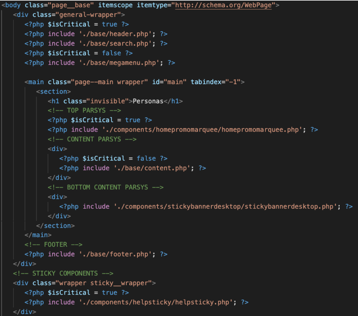
We created a PHP page for each component and included them in the content.php file. This made it easy to modify content. We could take this a step further in future tests by choosing which elements to include in the content using a parameter, allowing us to adapt the page quickly.
With this base setup, we implemented a mechanism to quickly change between different CSS loading scenarios using other parameters in the URL.
Hello cssLoader.php
We implemented most of the CSS loading strategies in the publishCSS.php and cssLoader.php files—the URL parameters in these files determined how the CSS files would load.
Included in the head tag, publishCSS included critical CSS files, with or without additional styles depending on the strategy. This controlled the styles on a global level.
On the other hand, the cssLoader controlled styles on a component level (how many files per component, with what priority, using asynchronous vs. lazy loading, etc.).
This is how we included this template in the code:

This code loads the marquee, promomarquee, and promobox styles separated by media queries. It doesn’t use a lazy loading strategy but can be loaded inline if configured in the URL.
The End Result
In the end, we had a setup that allowed us to switch between at least 18 different loading strategy combinations quickly. By adding other parameters to the URL, we could toggle multiple loading strategies on the fly. It was an exciting challenge to design this testing process and coordinate the different variables.
In part 2 of this series, we’ll dive into the big question: How can we select the right combination of loading techniques and strategies for a website?