Between the Backend and the Frontend - Robust Configurations for AEM 6.3
There are some tasks that are somewhere between the frontend and the backend. AEM 6.3 can help streamline these tasks.

Imagine the scene: you’re looking at an AEM design page in which all site configurations are defined. In this page, there are around 2,000 lines of code. The lines include data validation, data formatting, layouts and templating, as well as component configuration. You see configuration switches, coming from page properties and components, client library definitions, and the declaration of allowed components and their children as well as the default configuration for those components. Each of these lines is dedicated to accomplishing a very different goal, and they all exist in just one file.
A key question arises: who is responsible for this design page?
A frontend developer might assume that this code is more the responsibility of a backend developer. But what happens when the back-end developer believes the same thing? “This isn’t my responsibility - this is for the frontend folks to look after. It’s on them.”\
Apart from the maintenance issues (and the "who’s accountable for what" dilemma), the overuse of component configuration can generate higher costs for businesses. This is because not only will they require the complexities to be documented, but the business’ authors also need to be trained, and documentation needs to be created, all of which will increase total spend.
Introducing: the middle-ender
What this hypothetical (yet common) scenario shows us is that, increasingly, we need developers to meet in the middle. Developers need to see themselves not just as frontender or a backender - but also as part of a new category of developer: the middle-ender. Indeed, at the Netcentric summit in Seville in 2016, Gabriel Waltz from Adobe suggested that there needs to be a more dynamic and fluid relationship between frontend and Java developers. Fortunately, the Adobe Experience Manager (from version 6.2 and onwards), provides developers with several tools to better organize the complexities within the code, (and to collaborate) and feel accountable for what lies between the backend and the frontend.
These features are enabling the rise of the middle-ender, so let’s take a look at them:
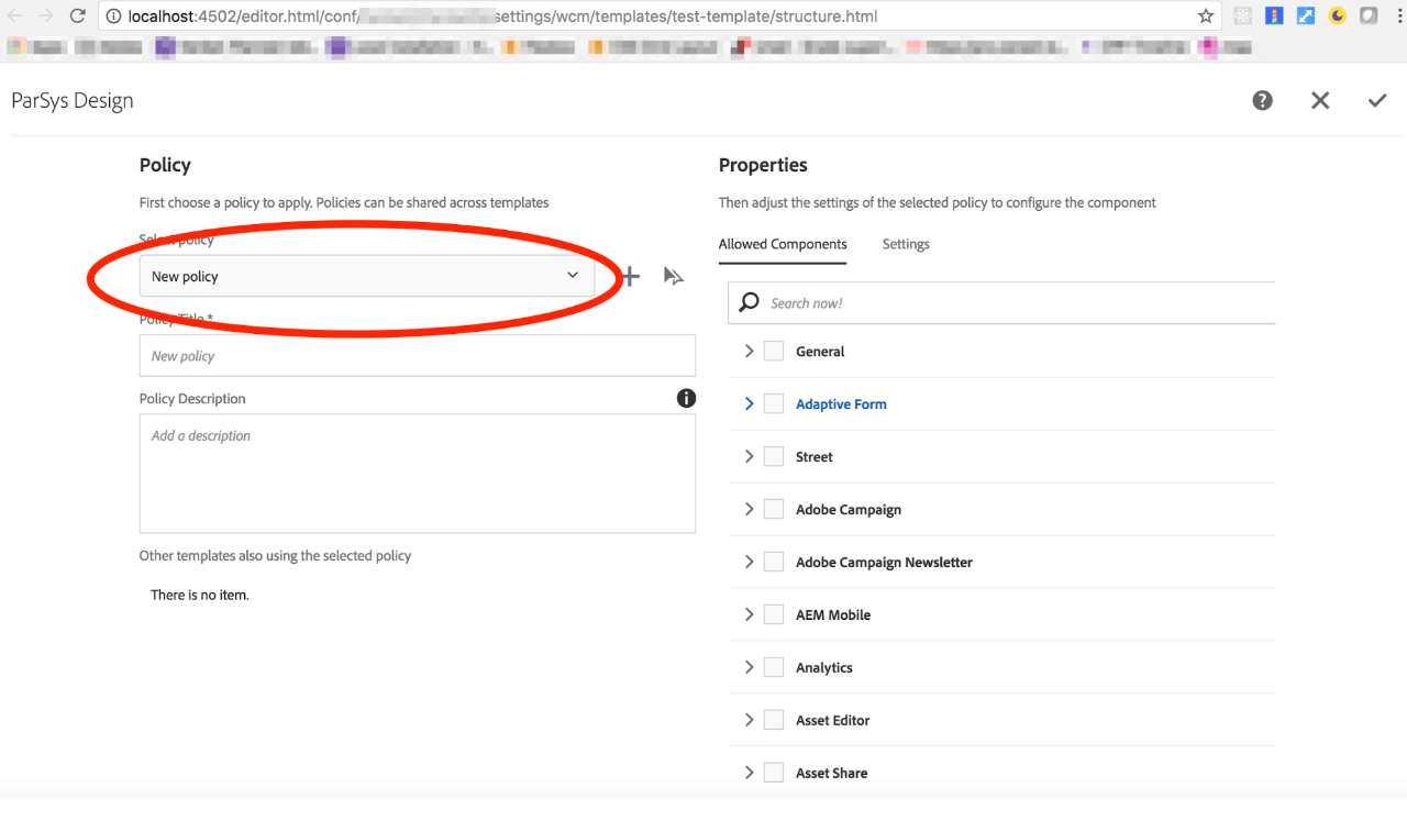
1. Content Policies
Available from version 6.2, Content Policies are an example of these tools. Content Policies are reusable design configurations that can be defined for both templates and components. To leverage content policies, developers must recreate a similar content structure than the one provided by Adobe in its we.retail recommendation.
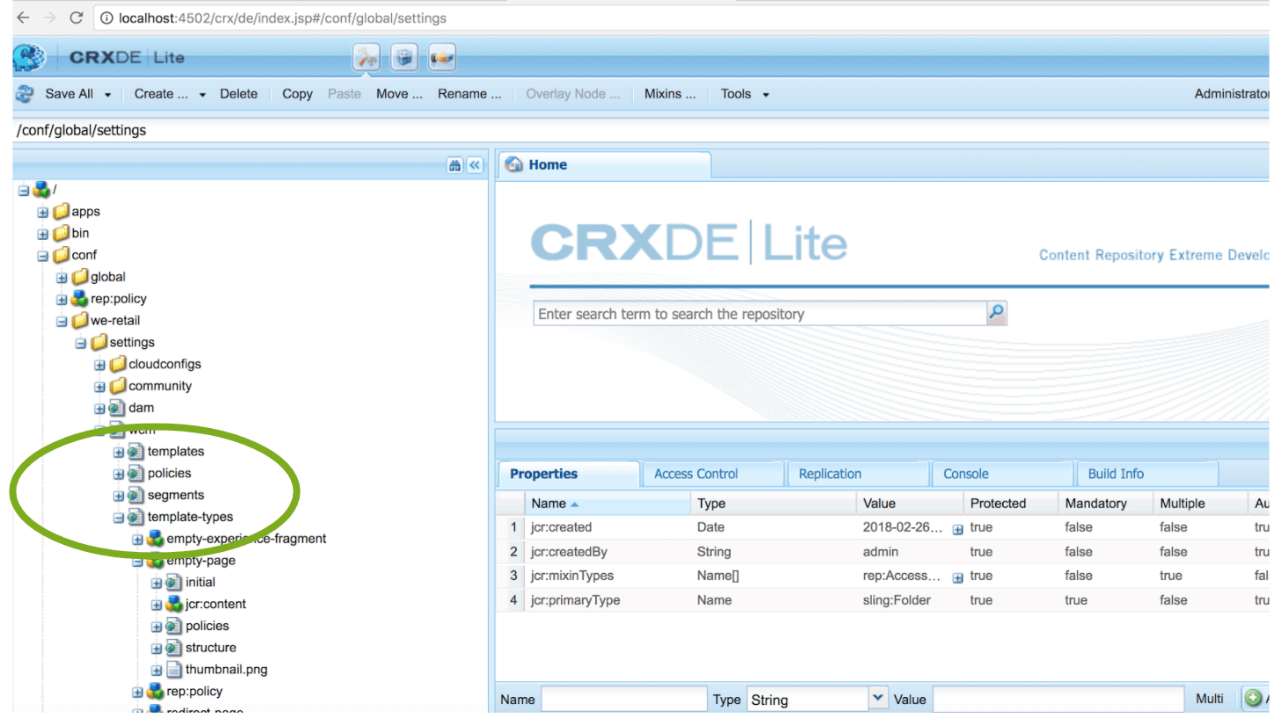
A user with the Template Administrator role (or a developer) could define a client library category that they would like to load for the template, as well as any page based on it. Therefore, the user can define a policy in the page design, give it a name, a title, and a description, and then set one client library or an array of them, and they will be loaded accordingly. Defining a policy for container components, such as the paragraph system is mandatory, because that’s the only way to tell the parsys what components are allowed within it.
One important point to keep in mind is that Content Policies are only available for projects authoring on TouchUI, which means that they're not available on ClassicUI.
2. Mapping Policies Across Locations
An important feature of Content Policies, is that they can be shared across templates, so the user/developer doesn’t have to define them every time. They can define them once, and then reference them; they can be selected from the UI in a drop-down menu.
Another key benefit of Content Policies is that they can be referenced from across locations, making it easier to replicate pre-written instructions. That way, if a content author or developer wants all the definitions in a Content Policy to be replicated in a different template or component.
If, for example, a template author had a global policy in their global folder, they could go to the content page to find it. There, instead of defining all configuration aspects of the policy again, they could just map it to a pre-existing policy resource type for reutilization.
3. Style System
Policies may also be used to facilitate the retrieval of AEM properties, especially when integrating a JavaScript framework. New integrated configuration tools make it easier, and more efficient, to carry out performance costly operations, such as DOM manipulation. And for that, we have now the brand new Style System.
Style System is available from version 6.3, installing feature pack CQ-6.3.0-FP-20593 and is now stable in the recently released 6.4 version. It is designed to give components different visual appearances and functionality via a simpler and out-of-the-box approach. Leveraging the Style System is especially useful when developing or maintaining complex platforms with global style and functional frontend dependencies, that are consumed from sub-projects with different requirements. Often in the past, it translated into creating more client libraries to host additional CSS and JavaScript overrides, deltas and extensions, with the typical specificity, code duplication and multiple initialization issues. Developers would write complex logic and implement expensive DOM manipulation techniques just to add a class to an HTML element. With Style System the whole process becomes a lot simpler and easier to maintain.
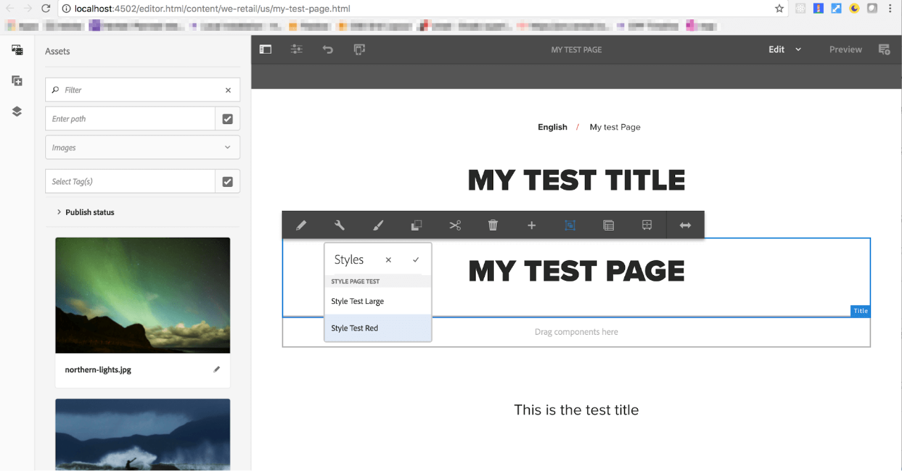
With Style System, developers and template administrators (or any author with the right privileges) can define custom classes in the style tab of a component settings page. As an example, we could customize a component style configuration by defining two specific styles, “style large” and “style red”, corresponding to a ‘teststyle__base--large’ and ‘teststyle__base--red’ class respectively. When adding the component to the parsys, the author would then see a brush icon in the editing tools menu. The above defined classes would then be available to use. It’s important to notice that the classes can be defined to be used individually or as multiple choice, allowing for a richer and more complex styling combination and output. Default classes can also be defined.
The selected classes are then added by the system to the cq_html_decorator tag, cascading down to the component.
Of course, the frontend developer would then need to write the necessary CSS and/or JavaScript code, to take effect when the classes are present. But leveraging modularization, encapsulation, bundling via webpack and even http2 capabilities, we can implement complex async downloads of chunks with impressive performance results.
Here are some ideas on how to include additional styles on demand:
- referencing clientlibs categories at a Page Design policy level for the desired template
- using ContentManager API to test for conditionals included in a data-sly-test attribute, and shipping the code only when strictly necessary
- lazyloading chunks via webpack depending on clientlibrary configuration
4. Core Components
Core versioned components were originally released in v1 for AEM 6.2, but are compatible from v2.0.6 for AEM 6.3 and above. These components provide increased flexibility since developers and architects had to wait until a new version of the Adobe Experience Manager CMS was released to get new components or component features. With Core Components, updates are available as a standalone package, to be independently installed. This essentially provides system designers with more power and flexibility to decide which version they want to use.
Some important aspects when deciding to give Core Components a try, is they
- require Java8
- only support TouchUI enabled authoring
- must not be directly referenced, but proxied, as per the Proxy Components Pattern
Conclusion: Making It Easier To Become A Middle-ender with the Power of Configurations
The end goal here is to increase fluidity between the roles and remits of back-enders and frontenders, particularly given that, in the complexity of the modern technological climate, so many tasks now seem to fall somewhere in the middle. The robust structures of AEM 6.3 and all its new configuration systems and versioned granular control for components, make these ‘in-between’ processes significantly more streamlined and intuitive. These features and structures help us progress towards confidently referring to ourselves as ‘middle-enders’, and dominating a broader region of the stack end.